Writing samples and commentary for a pest control e-commerce site
A Place for Everything
Legacy systems forced people to get creative, and not in a good way. Essential information like package size and product category frequently got shoehorned into the title to try and help customers. Otherwise, it wouldn’t be evident at all. I researched top ecommerce performers to get an idea of the best way to structure the plethora of information we needed to get across.
Is There a Problem?
Certain accounts don’t have access to certain products. When wandering into a section with said products, these users were greeted with a message that made it seem like a site error. A simple, considerate change in language can give customer service a break.
Not That Quick, Actually
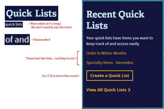
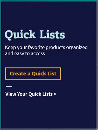
A CTA for “Quick Lists” (essentially a favorites section) muddled its message and buried its button.
Oh, That’s What You Want Me to Click On


